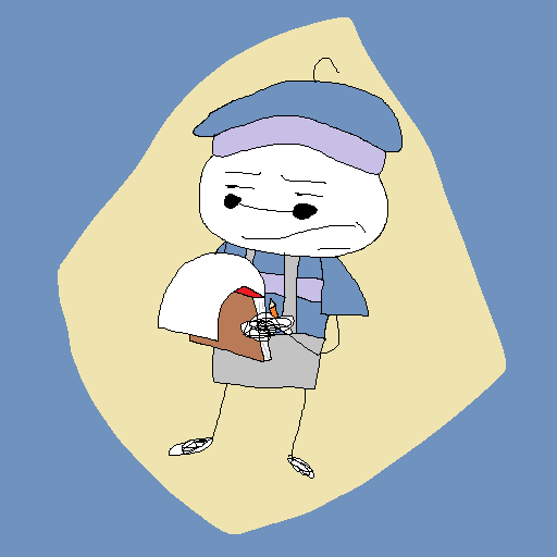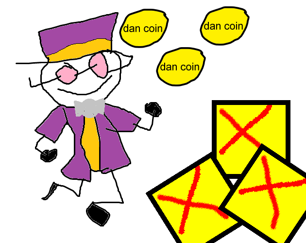


This artwork is horrible. The lines use antialiasing, but the colours inside those lines do not account for that, making the piece look like a five year old had drawn it in Paint.


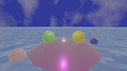
As an entheusiast in all things art, I was surpeised when I first discovered this piece. The Placing of each of the spheres feels perfect. It makes me wonder how far 3D art will get in the future (It is 2000 while writing this, for anyone from the future).


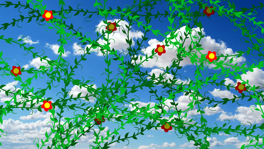
The vines and flowers have no texture to them, making them feel very flat and just pasted onto the obvious clipart that is the background.

